Monday, May 31, 2010

As in the Gold Mosaic of a Wall


Of the several worn poems in the pockets of my itinerant youth, one read like an Episcopalian invocation not so much of heaven as of an ancient, gilded utopia with its own trades of holiness. It is called Sailing to Byzantium, by William Butler Yeats. I still love it, and I read it whenever I need to be reminded, in the gloom, of art's clapping and golden rejuvenations.

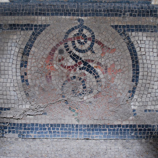
The great art of Byzantium, of course, was the art of mosaic--O sages standing in the holy fire, As in the gold mosaic of a wall. But more of Byzantine mosaics when we get to Italy. These mosaics on the floor of the arcades of the Palais Royal, too, walked upon, usually ignored (as floors tend to be), tattered in spots, are strikingly beautiful if you pause to look.

All of which raises the question in my mind: why is mosaic-making extinct? It seems perfectly suited to the modern imagination with its primitive and fragmentary images. Think of Basquiat set to mosaics. 

In this case design is well ahead of the fine arts. Dutch designer Marcel Wanders and Spanish designer Jaime Hayon, (one from his series of monumental vases above), both working for Bisazza, are giving the ancient art a modern twist.


Saturday, May 29, 2010

Crazy and Composed


Robert Delaunay was a paragon, with his wife Sonia, of the profuse, frantic energy of the Roaring Twenties in Paris--the parties, the collaborations and the multifarious inventiveness of art, architecture, design and the high, often hallucinatory life of Paris itself.  Delaunay's transition from the cubism of Picasso and Braque to the pure abstraction of Kandinsky was often delineated this way, as an ecstatic combustion of circles--planets, suns, orbits--forms that could be both connotative and abstract.

The second is a serial work by the neo-constructivist, Francois Morellet, in which white balls resembling ping-pong balls are suspended in cubic mirrors, creating multiple reflections.  

In both works, one madly symphonic, one mathematically precise, one may see the same profusion of circles.


Thursday, May 27, 2010

Sketches in a Paris Window


Fabric sketches in the window of designer Dries Van Noten. Van Noten was one of the spritely tribe of Belgians who burst on the Paris scene in the 80's, another of whom is a favorite of mine, the mysterious Martin Margiela. Margiela. Like another Antwerp star, Ann Demeulemeester, Margiela blends couture finesse and bohemian affectation. Now he is gone and his label, like that of Alexander McQueen, will carry on with surrogates. St Pauls in place of St Peters. 

Years ago, we were visiting a friend in Antwerp. We passed a simple stucco house which our friend said had been designed by Le Corbusier. I asked if we could stop, which we did, and our friend, declaring that he knew the inhabitant, knocked on the door. An upstairs window opened and a sleepy woman, coffee cup in hand, leaned out to see who was knocking. It was Ann Demeulemeester.  


Sunday, May 9, 2010

Rejuvenating Gridlock


Nothing, really, but appearances connects these two images, one (from the preceding entry) of a garden bed in Paris, and the other from an Egyptian funerary object. Both are earth-brown, both are diagrammed as grids, and both in their respective ways represent the fertile induction of new life, or the next life, or the continuity of life after death with the same delphiniums, toads, cereal bowls and ibises as before.

Thursday, May 6, 2010

Mischief and Mathematics


On the first Monday in May, a phalanx of green-garbed gardeners appears in the Luxembourg Gardens., some driving smoky fork-lift trucks delivering enormous palms through the open doors of the Orangerie to their summer positions around the park; others tilling the beds and, with mathematical exactitude, making lines in the soil for planting summer flowers.

To their mathematics, add mischief. Once, standing in another Paris park, enumerating the glories of Gallic garden design to my students, a sprinkler behind me suddenly sizzled to life, sousing me in an instant. Off in the distance, one gardener was turning a valve with a long wrench and another was rolling over with laughter. My students were no less amused.

Monday, May 3, 2010

A Forgotten Façade


Napolean decreed that sycamore trees should be planted all over Paris--a better idea than invading Russia. Today those sycamores, along with plane, chestnut and other trees, thickly lining the boulevards and parks of the city, give Paris its distinctively arboreal feel.

Greek temples, with their thick girth of pillars, were meant to simulate groves of trees where rites were performed and where abided sylvan gods and spirits. The Romans adapted those pillars for their own religious and civic architecture; Renaissance architects revived the style, and then Louis XIV made it his house style in Paris, with Corinthian pillars arranged in metronomic couplets across the width of his palace façade. To be sure, for Louis as for Napoleon, the pillars were less suggestive of nymphs in emerald woods than they were of imperial Roman glory.

Just about the time the king finished this imposing neo-classical façade, however, he lost interest in Paris (Louis in fact never liked insurrectionist Paris) and moved to Versailles. By that time, too, the hub of the city had moved farther west along the Seine, to present-day Place de la Concorde. The palace got turned around and the Tuilleries became the front yard. Even today, few people coming to the Louvre see this forgotten back wall; even fewer realize that it was once meant to be the frontal glory of the palace.

Sunday, May 2, 2010

Venet at Piece Unique


The French Richard Serra (though Richard Serra is almost French himself), Bernar Venet is a bender, twister, ruster, toppler and stacker of enormous rails of steel. Best known for his monumental, rumpled spirals of continuous steel rails, square in section, he also has created, over the years, concatenations that look like a scatter of pick-up sticks composed of either identical straight or curved pieces of steel.

The railroad was first completed in France in 1855. Many of the original railway stations still exist in Paris, latticed pavillions of iron and glass. The Biblioteque Nationale by Henri Labrouste and of course the Eiffel Tower remind us of just how French were the early wonders of iron and steel. Serra, one feels, stands in the American tradition of industrial steelwork with its titanic arcs and warps and junctions; Venet stands no less in that of the French.

At Galerie Piece Unique in Paris.

Saturday, May 1, 2010

And Speaking Of . . .


. . . Monsieur Buren, we happened to walk through the Jardins du Palais Royal this sunny May 1 afternoon when (Labor Day here) little more than the parks and sidewalks were open, and there came upon the shorn orchard of his black-and-white striped pillars. No one can deny the delight they afford to children and agile adults who enjoy scaling the pillars and perching on top. It makes a good picture. But the aesthetic delight they afford is meager. An artist needs more than one good idea, and Buren has never evolved beyond his use of awning (or crosswalk) stripes which, to begin with, had not added anything of particular interest or novelty to the diction of Minimal art.

Or if not derivative, too barren, too repetitive, lacking that nuanced punctuation of nicks and flaws and discolorations that makes great Minimalism great.

Does Daniel Buren Come to Mind?


The crosswalks of Paris.

Next Level Galerie


Austerely minimal work by London designer, Philippe Malouin, is on display at NextLevel Galerie in Paris. A metal lattice provides the basis of the table, and constitutes the entirety of the vertical lamp: a spiderweb of aluminum rods connected by minute tin connectors, each fitted together with the refined precision of jewellry. You may think of a cage, or you may think of something altogether more diaphanous, but the works are very much within the classical Minimalist tradition of Sol LeWitt and Carl André--take a module and multiply that in strict geometric profusion. The problem with such impeccable geometry is that anything else becomes unassimilable. Hence, the light bulb in the Olie lamp feels like an appendage in the impeccable latticework in which it is suspended.

Still in all, an austere mechanical elegance predominates.